

Every curve begins with a rule. Every letter begins with intention.
When we encounter Arabic letters in modern art, we often respond instinctively to their rhythm, presence, and confidence. What we rarely notice is the design discipline behind them, a proportional system known as al-khatt al-mansūb, where nothing is improvised, and every stroke is measured.
This method, associated with Ibn Muqlā, gave the letter its architecture. A dot defined thickness. A curve followed a geometric arc. Ratios set the height, width, and movement of each form. The purpose was clarity, not decoration, a visual logic that artists still rely on today.
Later calligraphers used two words to describe a successful letter:
- mansūb — proportioned, built on its correct structure
- mawzūn — balanced, visually steady once the proportions align
Structure first, harmony second.
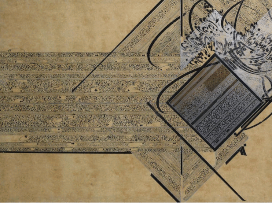
This duality is what makes the Arabic letter so compelling in contemporary art. It carries its own intelligence. Even when stretched, fragmented, or abstracted, the form does not collapse and the proportions hold. It remains recognisable, confident, whole.
Ahmed Moustafa’s work beautifully studies this. In his book The Cosmic Script, he shows that the letter’s strength comes from its internal order, not from decorative excess.
This is why the letter continues to evolve across canvases today. A form that has been engineered and reimagined for centuries.